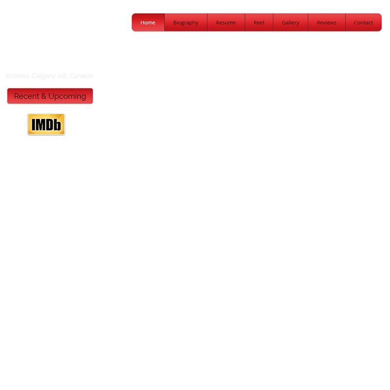
Listen, I understand the phrase "less is more", but this ain't it.
Google's homepage may have just a big search bar and nothing else, but this shouldn't be true of your website showcasing your work. Your actor website should impress your visitors, otherwise it looks broken...
This is what I thought as I started to contact the owner of this website on Twitter to let her know that something looks off. I got to the second sentence when the blank space of her website was replaced by a background image. It took about 2 minutes to load on a ultra fast internet connection. That's bad!
If I want to look at a semi blank page, I'll just go to google and admire their pretty search bar.
P.S. Black on Red is the title of a book about experiences in the communist Soviet Union. It should not be a design instruction for any element on your website.


